Sometimes, instructors come to the table with a course they’ve been teaching online for years. They’ve got their own system. Their own flow. And sometimes, someone nudges them toward the instructional design team because there’s potential to level up.
This post is about one of those cases—and how I used a simple demonstration to guide an instructor toward enhancing their Canvas module layout.
Why Small Layout Tweaks Can Make a Big Difference
Canvas courses can become cluttered over time. Especially when instructors add new elements each semester without a plan to tie everything together. It’s not always about the content—sometimes, the way content is presented is the real barrier for students.
In this case, the instructor was open to improvements but needed a clear example to understand the “why” and “how.” That’s where the power of demonstration came in.
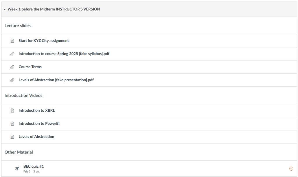
The Before: A Busy, Scroll-Heavy Canvas Module
Let’s start with the instructor’s original module.
It had a lot going for it. Each item was listed out clearly. Students could mark them complete and track progress. But the downside? It required a lot of scrolling. It wasn’t easy to see how the elements fit together. And for students, especially those on mobile, the experience could feel overwhelming.
The After: A Simplified and Structured Experience
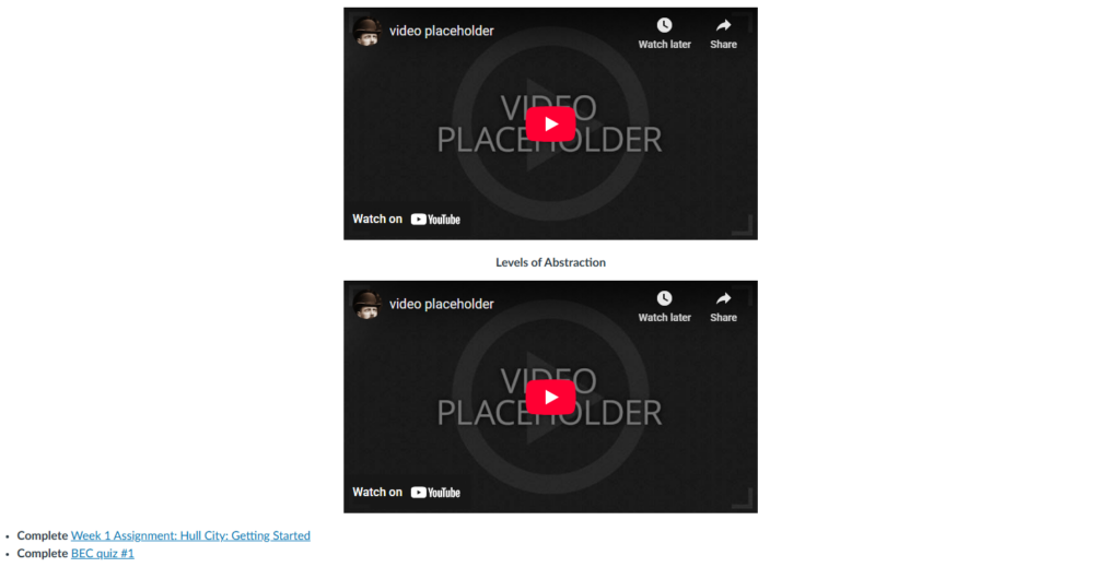
To demonstrate what was possible, I created an enhanced version of the module.
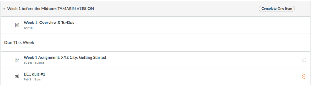
Here’s what changed:
1. One Page, One Purpose
The original module had separate items for videos, readings, and instructions. I grouped the instructional content into one organized page. This created a single point of reference for students to understand the week’s goals and tasks.
Instead of scattering materials, this unified structure showed how everything connected—readings, videos, and activities—all in one place.
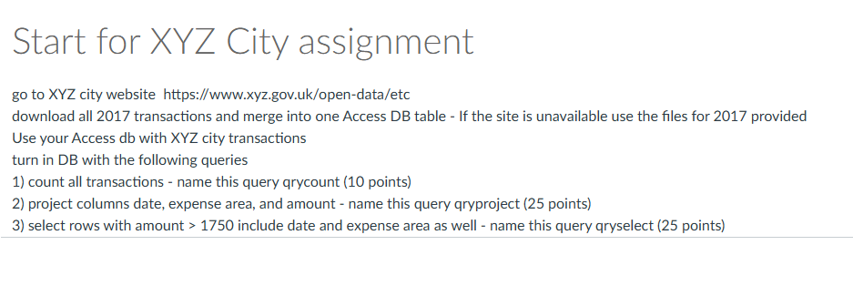
2. From Page to Assignment
The instructor had created assignment instructions using a regular Canvas Page. Since this was a hybrid class, students were submitting the assignment in person. That’s fine—but for grading and clarity, it’s better to set it up as an Assignment in Canvas.
In my version, I kept the “On paper” submission type but used the Assignments tool. This ensured the task showed up in the gradebook and was easier for both the instructor and students to track.
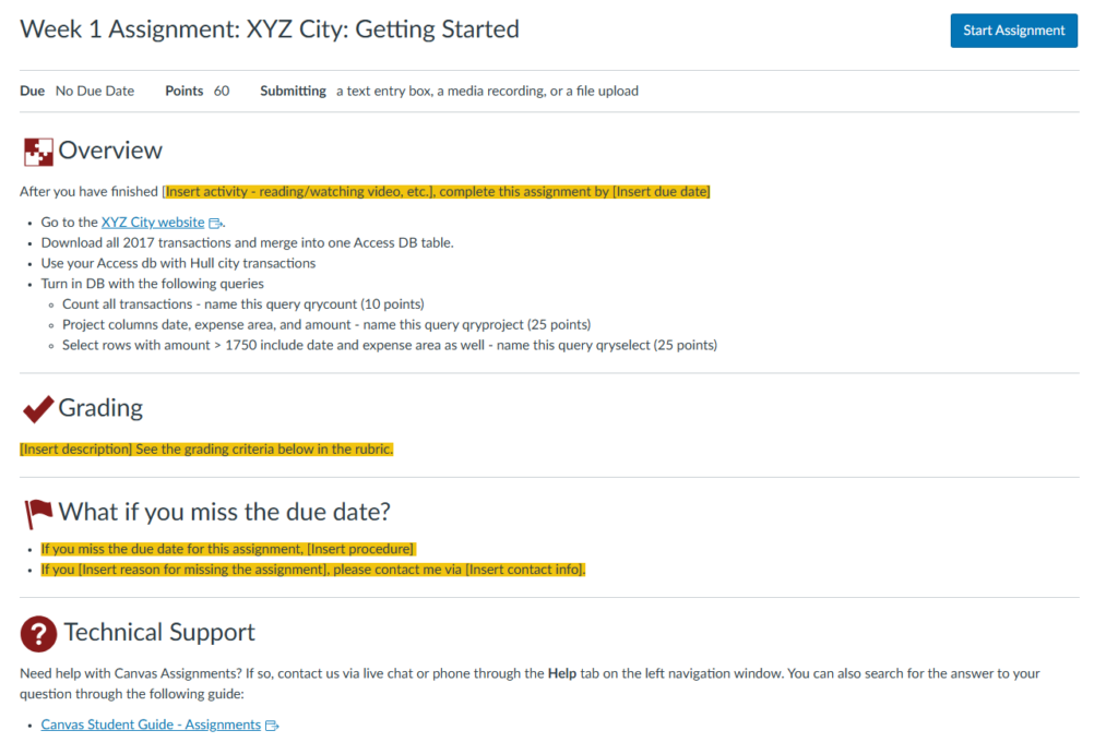
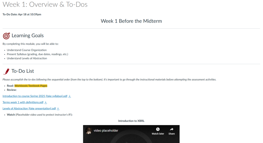
3. Framing Content with Learning Goals
Another key change was adding Learning Goals to the top of the page. This provided students with context before diving into content. It’s a small addition that makes a big difference in motivation and clarity.
Now, instead of clicking into multiple links without direction, students land on a single page that outlines:
- What they’ll learn
- What they need to do
- Why it matters
A Visual Comparison
You can check out both versions of the module here.
I’ve removed most of the instructor’s original content and replaced it with placeholder videos and files to keep the focus on layout, not content. The goal is to highlight structure—not to critique teaching materials.
Lessons for Instructional Designers
This process wasn’t about forcing a redesign. It was about offering a clear, respectful demonstration of another way to do things.
Here are a few takeaways that may help when working with experienced instructors:
- Meet them where they are. Understand what’s working for them and build from that.
- Use examples. It’s easier to sell a new approach when they can see it in action.
- Prioritize clarity for students. Every tweak should make the experience smoother and more intuitive.
There’s more than one way to improve a Canvas course. This demo wasn’t the final version—it was a first step. But it opened the door for collaboration and made it easier for the instructor to imagine what else was possible.